 (805) 705-3858
 (805) 705-3858
 Responsive Design
More than half of all web visits are now from a mobile device.
It is a mobile web.
Is your site mobile-ready?
If not, then you are losing customers as people who come to your site from a mobile device are getting a poor web experience. They have to "pinch and squint" and after a while, they just leave.
I can fix that. I can retrofit your site so it automatically re-sizes and reformats the content to accommodate the device of the moment. This is called "responsive design"
Examples of a few websites I've transformed into mobile-ready sites:
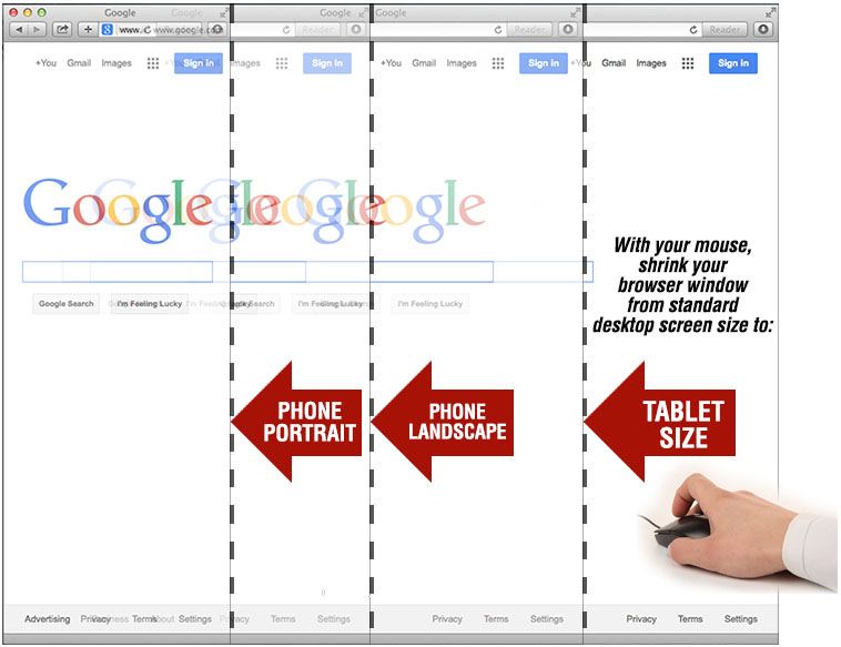
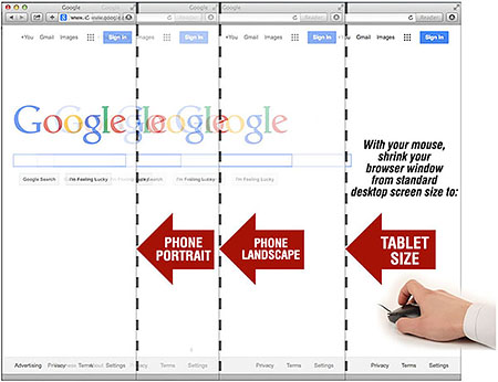
Take this site you're on right now for example. If you're on a dekstop computer, just re-size your browser window slowly and watch the page automatically re-size. (see "how-to" image below...) First to a size that accommodates tablets... then smaller to a size for a mobile phone in landscape view... then finally to the smallest size for a mobile phone in portrait view.
Note too: your site is still the same set of pages, so any edits show up on all views.

CALL ME... Call me for a quote on retrofitting your site to accommodate all mobile devices